2011-06-08

Project4-Caroma universal design


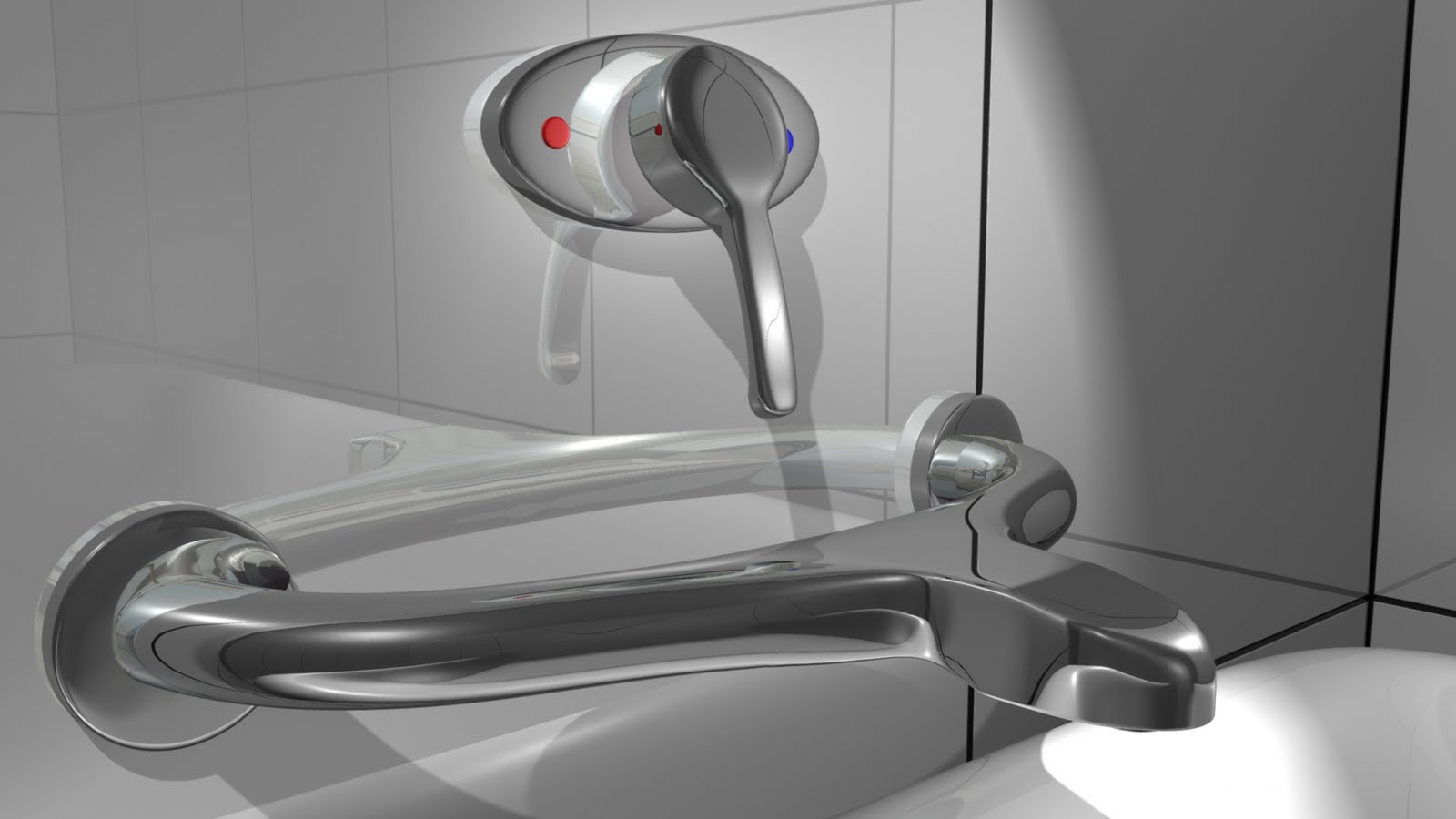
I'm doing tap, basically my tap has two parts, the main tap and the handle, both of them are stick to the wall.


The main part of the tap is a grab rail with a head where water comes out, I got this idea when thinking of people especially oddly, disable and children having trouble getting out of the bath, combining the grab rail with the tap makes it more connivance for them to stand up in the bath. However, as hot water is going through the tap, the tap itself is hot and touching it can be dangerous, I've made the inside tube isolated from the outside grabbing part to solve the problem. This board shows how people grab the tap using one hand or both hands. My initial design is like this, not coming out of the wall too much but with a long head, then i realized that the long head can be dangerous that people could bump their head on it, so i changed the head shorter so that it is not that dangerous with all the edges rounded off, then i made the space between the grabbing part and the wall larger to make it easier to access.


For the Handle part, it is pretty much the same as the traditional handle but longer for easier access and also less physical effort for children oddly and disable. I'm putting the handle above the tap instead of below the tap so people won't hurt themselves when turning on the tap with hot water coming out. But putting it higher may sacrifice the accessibility, that's the other reason why I made the handle longer. I've also adding the hot water locking system into the handle, it's a red button behind the handle, people can turn it into any angle when pressing the button, but children can just turn it into a preset angle without pressing the button. Or the water won't be so hot when the handle is accidentally turned towards the hot. As the button is behind the handle, children may not see it and play with it, also adults will not having any trouble pressing the button. The cross section shows how the button works.


And this is my tap design, here are some renderings showing how it looks like in the bathroom.

2011-04-16

Studio 2A Project 2 -Mr. Clean Bath Cleaner


Rational of the Mr. Clean Bath Cleaner Spray Bottle


The spray bath cleaner bottle is a redesign of the Mr. Clean Disinfecting Bath Cleaner under the Procter& Gamble.
As women do the most cleaning at home, housewives aged around 35 become the target market of the product. This group of people needs to do a lot of work every day so the product should be efficient and easy to use, and comfortable holding in hand for a long time.


-THE FLEXIBLE NECK

The most important feature of the new bottle is that it has a flexible neck connecting the bottle and the head. The existing spray bottles all have one problem is that when they are held upside down during using, nothing can be sprayed out because the tube inside the bottle can’t get the liquid. Adding the flexible neck is a effective way solving this problem, when experiencing hidden corners or underneath surface which usually need to turn the bottle upside down, the head now can be pull out and the neck bended over to spray without turning the bottle.


-THE LOCK ON THE HANDEL

The flexible neck will cause the holding part too long, moreover, it is not strong when holding in hand, the bottle below the neck will swing around during using, which is not very comfortable and convenient, so the movable lock is introduced to solve the problem. When the head is need to be pulled out, the lock will be moved down, and when it is not needed, the lock can be moved up to hold the head and bottle together so that the bottle under will not swing. The soft rubber lock also adds some grip and makes it more comfortable in hand.  


-THE SHAPE

As the product is mostly for women users, the shape should be more likely for women. Comparing to the existing bathe cleaner, the new shape is more soft feeling, and looks more like a product for female. The shape is also good for store delivery and shelving.


-LABELS

The front label uses blue as background to represent “clean”. (The head is also chosen blue to make the bottle one piece) The Mr. Clean logo is put on the top to show the confidence doing all the cleaning, the flexible neck picture is put on to tell the important new feature and the picture of clean corner is saying everything can be cleaned even the corners. All the use instructions and information put on the back label.


-MATERIALS

The main material of the bottle and the head will be HDPE (High Density Polyethylene), one kind of Polyethylene. This material will not easily get corroded by chemicals, and it’s strong enough for carrying liquid, so it is an idea material for chemical container. The rubber lock will use EVA (Ethylene-Vinyl Acetate Copolymers).


(Compare the existing one with the new one.)


Studio 2A Project 1 -MacBook Holder